Mountain Project
Scroll
Project Overview
Mountain Project App
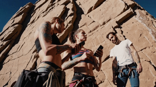
Mountain Project is a website and mobile App which serves as a guidebook to more than 170,000 climbing routes across the world. Members upload the route, with its name, grade, and most times a picture of them climbing it.
Even though being bought out by REI and having many features added to it, more people still use the paper guidebooks for their specific climbing crags.
So why is it that more climbers still use the guidebook over the Mountain Project App?
And what can be done to bring more people onto the App?
Why
So why do climbers use the guidebooks over Mountain Project?
When we asked a group of 8-15 individuals the most common answer was knowledge; and the security that knowledge gives them.
They concluded that the guide books are essentially more in-depth, and contained all the vital information they, as climbers, required; such as name, grade, a detailed description of the climbing route and an accompanying image to support it.
At first, I was a little confused by the answer because Mountain Project has plenty of detailed route descriptions within their database; many of which I appreciate myself.
However, as I started to look through the database of climbing areas, I started to see a trend. Most of these descriptions were great at detailing how to get to a climbing area, and how to locate various climbing walls within them, yet only 50%-70% of those climbing walls had every route detailed thoroughly.
This was significant, because they were missing details such as:
How fun the route is to climb
The height of the route
What length of rope is needed to scale the route
How many safety bolts have been installed along the route
A reference picture
This gave me a clear understanding of my focus group’s conclusion and why Mountain Project is seen as a last resort and only used when someone forgets their guidebook.
What
So what can be done to make Mountain Project the best digital guidebook for climbers?
Firstly, we needed to make sure that all necessary route information was actually captured. But why stop there?
Let’s go that step further, making paper guidebooks truly obsolete and Mountain Project something REI can truly be proud of.
Goal
The goal for this project was to improve an existing feature so that users could capture the necessary details of various climbing routes more thoroughly and easily.
Then to go a step further we will look at how we can leverage AR features to make route capture easier, therefore improving user experience when using the app to find climbing routes.
My Role
UX Designer
My role for this project is to enhance the user experience of the Mountain Project App, while also being asked to increase its profitability.
Research
Specific Research
With our goal in mind I interviewed a larger group of people, with greater diversity of climbing experience, to gain a more detailed understanding of how and where the Mountain Project App could be improved.
The results mirrored those collected from the smaller group. This time, however we were given more information as to why climbers still prefer guidebooks over the Mountain Project App.
The results showed us that users enjoy the emotional and sensory interaction of filling out the guidebooks as they complete each climbing route. Some of these interactions included crossing routes off and adding sentimental notes for future reference.
Survey Results
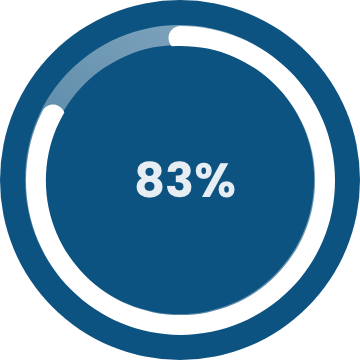
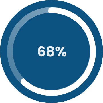
I surveyed over 100+ people and found the following data.
USE

ACCURACY
EXPERINENCE

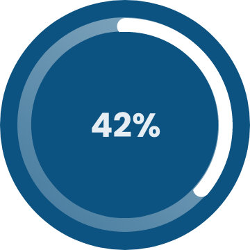

Use Mountain Project due to forgetting their guidebook.
Believe Mountain Project is more accurate than guidebooks.
Feel the app is outdated in its design and leverage of modern design features.
Interview Insights
I interviewed 8 people to try to understand some of these issues more in depth, this is what I found out.
“Mountain Project is reliant on individuals uploading the information, hence the loss of detail.”
“I like to be able to look back at all my notes in my guidebooks, they bring back fond memories.”
“Mountain Project is my go to app for finding routes if I don’t have a guidebook for that area, but the way they present essential information is pretty inconsistent."
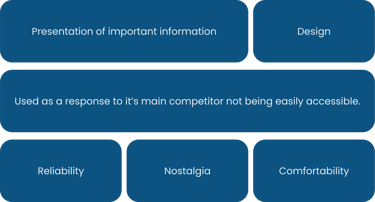
Affinity Diagram
The interviews and survey helped us narrow down what people were wanting/experiencing. These are some of the main points.
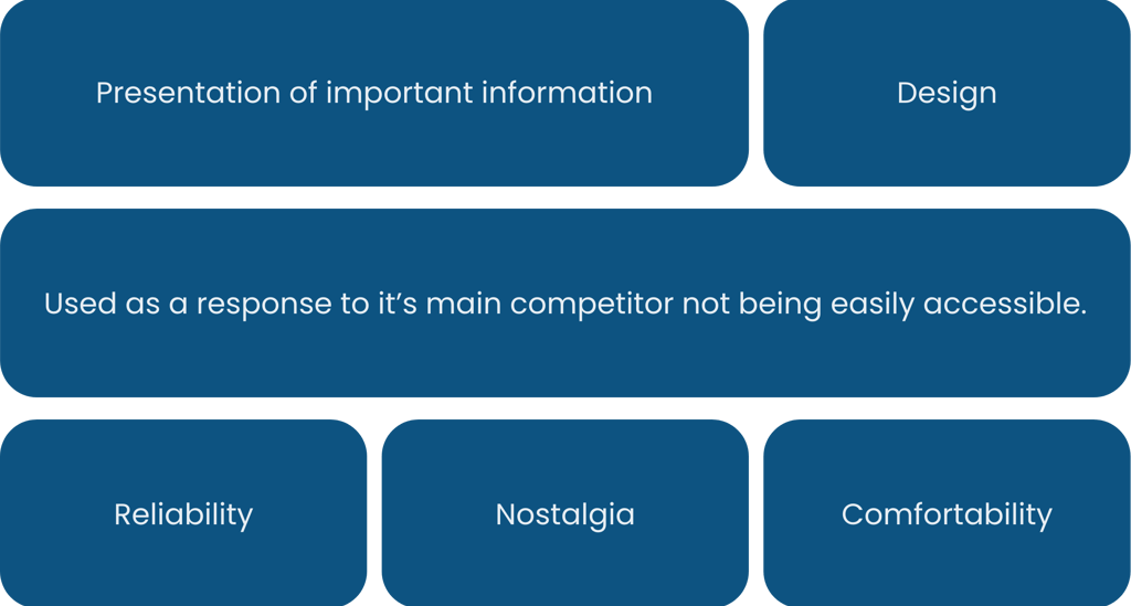
Comfortability came up many times in the interviews. People reported that they prefer guidebooks as these do not contain controversial climbing route names, unlike those entered by users on Mountain Project.
Mountain Project did see some controversy a few years ago when it came to the issue of route names. Many of the names were politically incorrect; and some just inexcusable. People felt that Mountain Project and in fact REI weren’t doing enough to combat this issue.
Molly Richdale
User Persona


Pain Points
Bad sense of direction
Hates long approaches
Will not climb a route unless they know the length of route and amount of quick-draws needed.
Goals and Needs
Find a sport climbing area
Clearly find easier routes
Knowledge of the route so they can climb confidently
Age:
29
Occupation:
Physical Therapist
Location:
Seattle, WA, USA
User Scenario
User Story
As a climber,
I want to find detailed information about climbing areas,
So that I can find and climb routes to my full physical ability with ease of mind.
User Flow
User Flow Focus
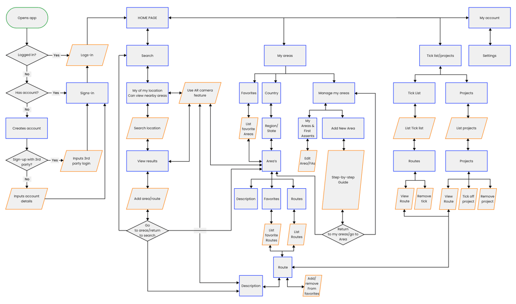
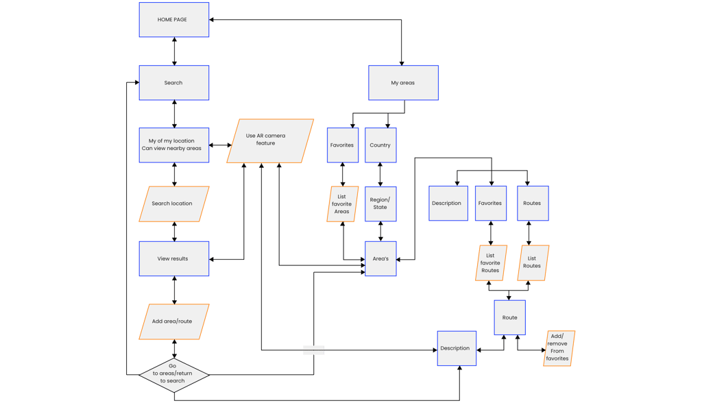
For a user such as Molly, our job is to focus on searching and navigating already existing climbing areas and routes.
LoFi Prototype
Design Choices
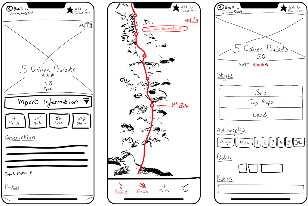
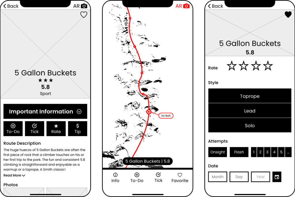
Following my research I felt that route details and route safety were important information to incorporate for both climbing areas and individual routes. So, we included a hero image followed by the route name, grade, and climbing style required to complete it.
I also included the AR camera feature that would allow users to not only find and identify the route, but also give them clarity on where to locate the bolts for climbing a route safely.
I experimented with user controls to see if people would be interested in being able to turn certain features on or off, depending on what they were trying to get out of their climbing experience.
User Testing
I tasked the interviewees with the following:
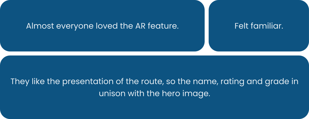
I interviewed 12 people and found that some of the main highlights were:
The only concern expressed about the AR feature was a moral one; does it belong in the outdoor climbing experience? This is a valid point… And one I would come back to.
🤨 Find a specific route in a climbing area
🤩 Identify it by the AR feature
👍 Tick off the route
Pitfalls
Out of the 12 people I also found that some of the main flaws were the following.
1st Round of Iterations
What we Learnt
Based on the user testing I knew I needed to undertake some basic iteration. And the incorporation of the AR feature needed to be addressed.
These are the 3 main areas I decided to focus on while awaiting responses from user groups regarding the moral issues surrounding the AR feature.
TIPPING


FAVORITE ICON
AR NAVBAR
How and where should I incorporate a tip feature?
To heart? Or not to Heart? That is the question.
What are the practical features for the AR Navbar?
MidFi Prototype
Moral Dilemma
After multiple discussions regarding the morality of AR and electronics belonging in nature and the climbing community, I decided to keep the feature.
I came to this conclusion because the main concern of my focus groups was safety; and the AR technology would help us to decrease the risks of climbing outside. However, there are still pockets of the climbing community who see risk as being part of this extreme sport, believing safety measures to be a moral breach of the overall experience.
Guerrilla Testing
I wanted to ensure that my decision to integrate this technology was in-line with the majority of Mountain Project users. So, I went to a local climbing gym for an informal chat with members of the climbing community. I wanted to keep the question regarding this technology as open as possible; to see if the moral concern found its way into our conversation.
“How do you feel about technology being at the crag?” (a natural rock face used as a climbing wall)
🏞️ “I’m ok with it as long as it doesn’t interfere with my climbing and being in nature.”
🔊 “I hate it when people blast music!”
👷 “Technology has led to bolting climbing routes, ultimately making them safer and more accessible… So if that keeps happening, I’m ok with technology at the crag.”
The answers I received supported my decision to include the AR feature because it would not interfere with others’ climbing experience.
Design Choices
After making that decision, I began integrating the other features and switched the “favorite route” icon from a star to a heart; ensuring clearer representation of its function. I also reflected on my focus group’s feedback, and decided to remove the “share” feature, replacing instead with a “tip” feature.
User Testing
I assigned my interviewees with the same tasks I had prepared for the LowFi test, helping me to better see the features perform in a way I was hoping for. We interviewed 12 people, 4 of whom were from the previous user testing group, and uncovered some of the main highlights:
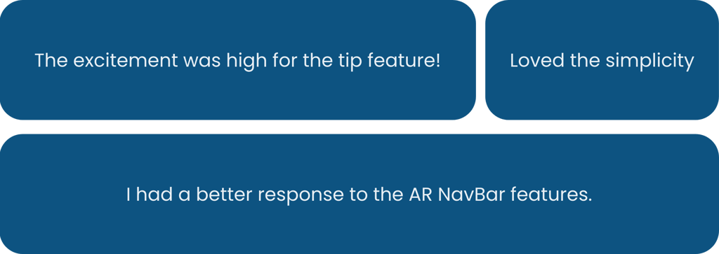
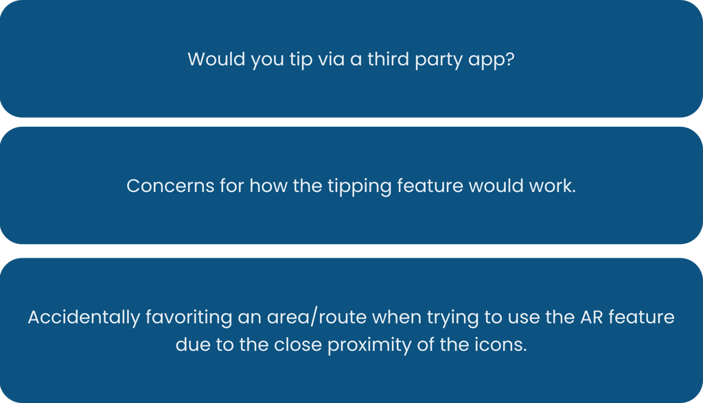
Out of the 12 interviewees I also found some of these flaws:
2nd Round of Iterations
What we Learnt
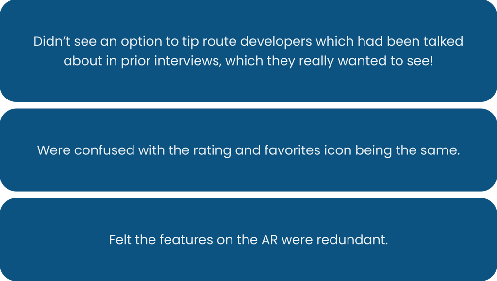
There was clear and apparent confusion surrounding the “tip” feature.
TIPPING

THUMBPRINT
After all the confusion with the “tip” feature, we decided to table it, instead developing a plan to modify and improve it in the future.
We noticed how close the app’s icons were in the prototype but decided to leave them and see if anyone picked up on it; they did. So, we decided to undertake a small, simple, yet effective UI change.
UI Style Guide Recommendations
Vibe Check
Mountain Project has quite a nice logo and brand feel, but there was room for improvement.
I decided to dedicate some time to helping stylize what they already had in order to help the UI standout a little more.
The biggest change I made was locating and implementing a better shade of blue that would pass AAA stands for accessibility.
CURRENT BLUE
SUGGESTED BLUE
Contrast Ratio: 5.39 : 1
This will NOT pass AAA standards
Contrast Ratio: 8.02 : 1
This will pass AAA standards!

HiFi Prototype
Design Choices
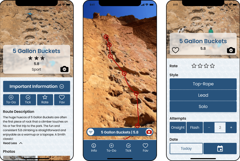
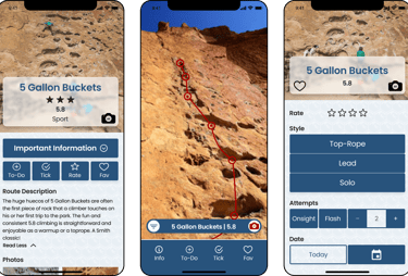
We also used “Glassmorphism” for some of the title displaces so that we could display an image of the route for the climber’s reference.
Next Steps
Tipping
We really wanted to devote some time to helping the people who map out climbing areas for others; those who’re colloquially known as “climbing dirtbags” and don’t make massive amounts of money.
We feel the “tip” feature would allow climbers to show their appreciation to the people that make these climbing destinations better for all other users.
It would also be a revenue driver as Mountain Project would take a small percentage of this tip.
Proj. Mercury
Andersen Construction reached out and asked if I could consult on one of their projects. What started off as an advisory role has turned into a leadership position where I’m responsible for the team that’s designing their bespoke in-house software.
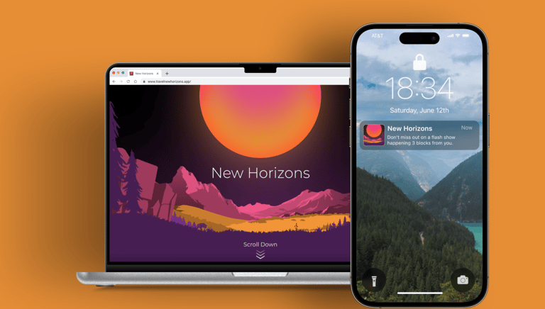
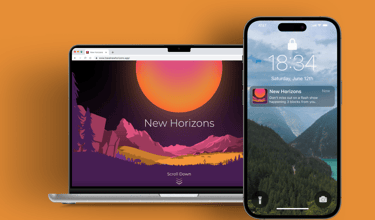
New Horizons Travel App
New Horizons is a travel booking and management company set on making vacationing as stress free as possible. It does this by leveraging machine learning and utilizing cross platform applications on commonly used devices.