Proj. Mercury
Bringing the construction industry into the the future.
LEAD UX DESIGNER | 18+ MONTH CONTRACT
Project Overview
Find a solution to replace their old system, which forced users into rigid workflows, and made it frustratingly inefficient.
The Challenge!
The Mission?
Design new software from the ground up, making sure it retained the capabilities of the old software while prioritising the user’s experience.
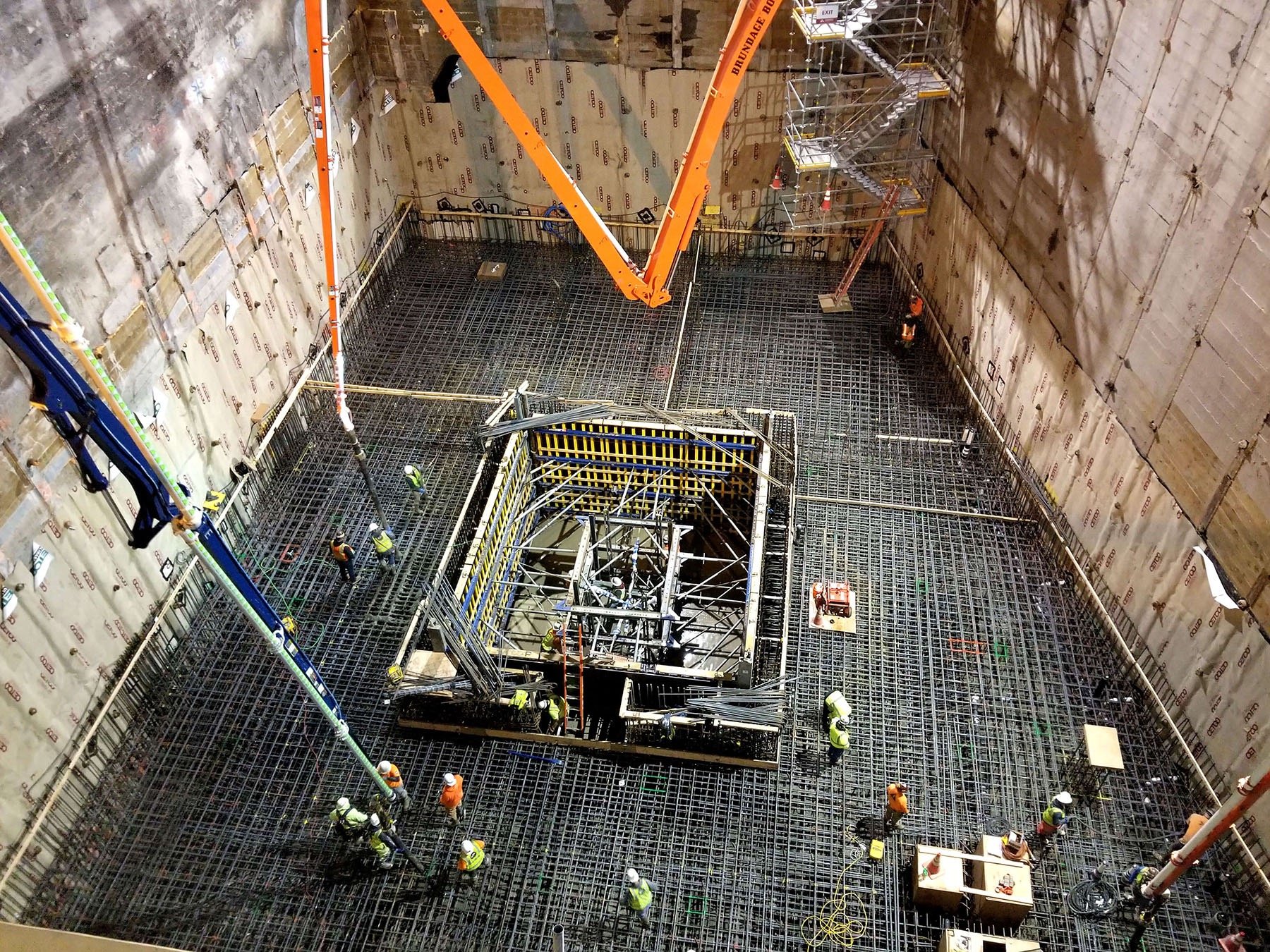
It’s a good job Andersen Construction builds big! Like sky scraper big. Because when it came to the monumental challenge of replacing their task management software, they were up to the task.
My Role
When my team joined the project, Andersen already had an early desktop prototype. Instead of making assumptions, we went straight into user testing. Feedback shaped our approach, revealing the importance of flexibility.
While developers iterated on the desktop version, I set up user testing and led work on mobile designs, evolving them from low-fidelity wireframes to high-fidelity prototypes in Figma.
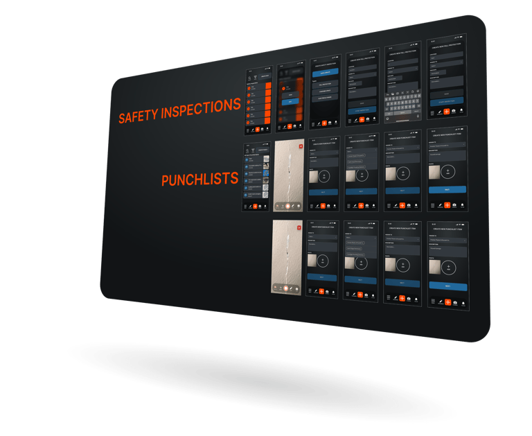
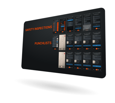
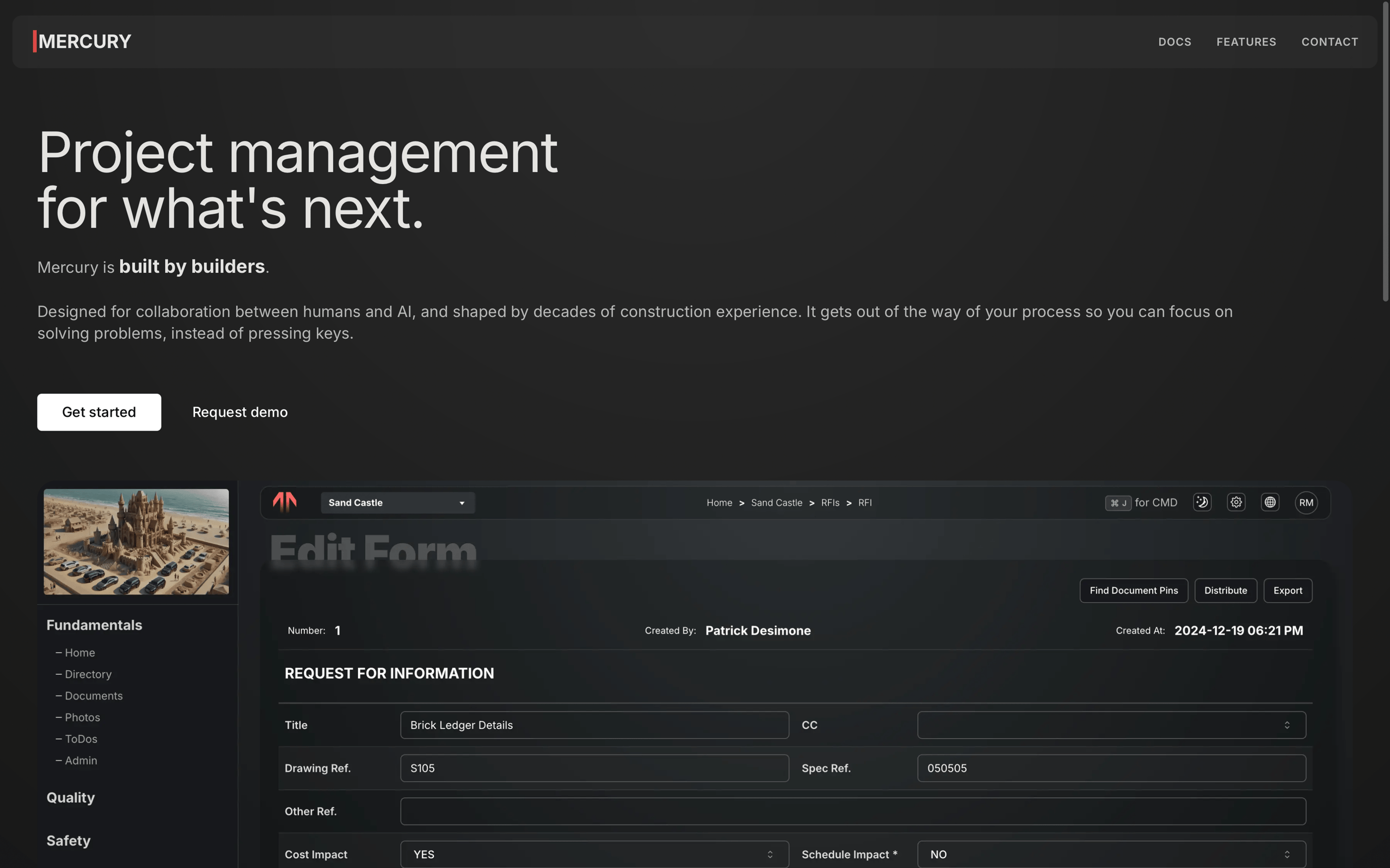
The Solution
Rigid workflows were replaced with customization and adaptability. Project managers could tailor views and filters, while field workers could enter data through multiple methods to fit their workflow.
Flexibility
Usability
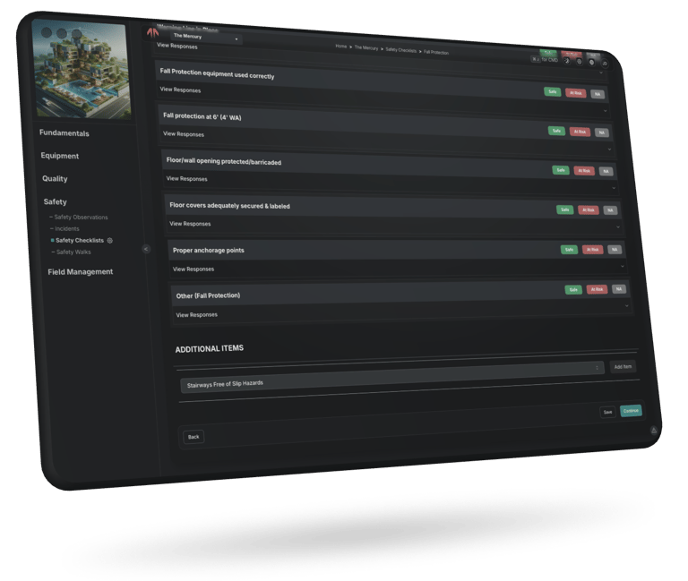

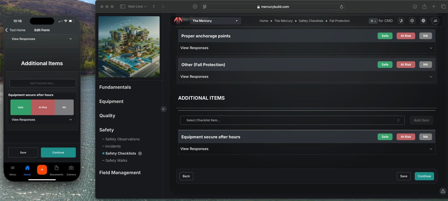
Safety was a major focus. Observations could now be logged as stand-alone reports or attached to formal inspections, allowing real-time tracking of jobsite risks. Incident reports were simplified; only a name and title were required upfront, with additional details added later when needed.
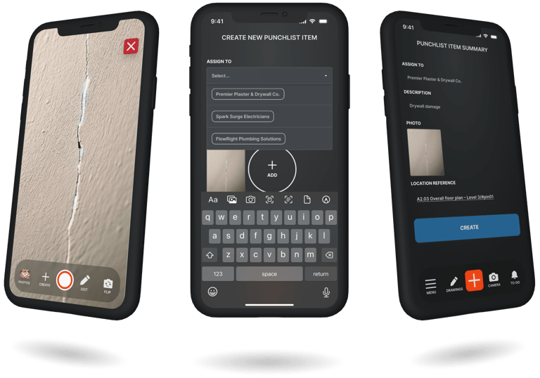
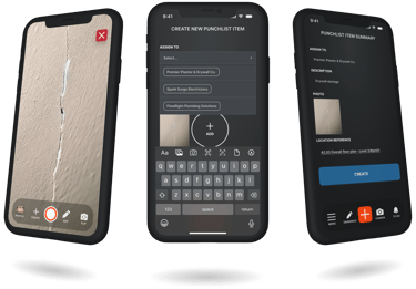
With six months of user research and testing, one thing became clear; everyone works differently. The old software forced a singular approach; but we gave users options. For instance, punch list items could be entered traditionally or captured immediately from a camera preview. This flexibility ensured that no matter how someone worked, the tool accommodated them.
Impact & Results
The software is now deployed on six active projects, proving its reliability. Real-world testing helped iron out small issues before full deployment. User surveys show a 96% satisfaction rate, a testament to how much more intuitive the tool has become.
6+
96%
Satisfaction Rate
Deployments
Lessons Learned
This project reinforced a key design principle; options create usability.
When users can approach tasks in ways that make sense to them, efficiency improves. Real-world testing also proved invaluable, as no assumption is stronger than watching users interact with a tool in their actual work environment.
Final Thoughts
This project was more than just building software; it was about fixing workflows that were broken by out-dated software. By prioritizing user needs and designing for flexibility, we created a system that adapts to workers; instead of making workers adapt to it. The result? A tool that’s intuitive, accessible, and built to last.
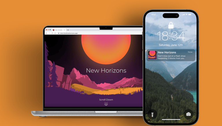
New Horizons Travel App
New Horizons is a travel booking and management company who want to make vacationing stress free. Their platform accomplishes this by leveraging machine learning and utilizing cross platform applications on commonly used devices.

Mountain Project App
I worked with REI to explore a potential redesign of Mountain Project so it could generate more revenue;while retaining its value for climbers. We looked at partnering with guide books and climbing area developers to enhance engagement without compromising the user experience.